Awards
Southwest Airlines:
Digital Wayfinding
Design & Prototype

PROJECT
CLIENT
SERVICE
- CX+
INDUSTRY
- Travel & Hospitality
Southwest Airlines worked with Continuum to improve the in-airport customer experience.
Challenge
In 2017, Southwest Airlines made some big changes to its brand. They rolled out some big new planes. They outfitted their people in stylish new uniforms and revamped their cabins. Their in-flight game was tight, but when customers walked through the door of the airport, their experience wasn't quite up to the same level.
Enter Continuum.
While Southwest was known for delivering best-in-class hospitality on their airplanes, they brought us in to help improve the in-airport customer experience, so travelers could get to their destination confidently while spending less time worrying about the journey.
We began by talking with customers, frontline employees, and Southwest's operations teams to understand the broader context and the operational constraints. Based on these conversations, we identified three challenges that needed to be solved:
Lack of Clear and Accurate Information
Lack of Clear and Accurate Information
We saw an urgent need to provide accurate information about flight status, departure gates, and departure times. We needed to stream contextually relevant information to customers and employees, in order to build their trust and improve their airport experience.
Excessive Gate Crowding
Excessive Gate Crowding
Because of Southwest's unique boarding process, it's important to keep the gate area organized. Southwest passengers aren't assigned seats, but board in small groups. The process is both empowering-you get to choose your seat-and it creates more anxiety (Is Group A lining up? I don't want to lose my spot!) which creates a unique tension for Southwest. Building on Southwest's penchant for doing things a little differently, we needed a unique way to address this issue that would serve customers well.
Need for More Meaningful Customer Service
Need for More Meaningful Customer Service
Different types of customers are often looking for similar information at each point in their travel. We needed to deliver answers to common questions (Is this the gate for Boston? How full is the plane?) so that repetitive employee interactions could be reduced while improving customer sentiment.
-
SDN Service Design Award
-
IDSA IDEA Gold Award (Service Design)
-
Fast Company Innovation by Design Award Finalist
-
Core77 Design Awards Runner-Up (Service Design)
Solution
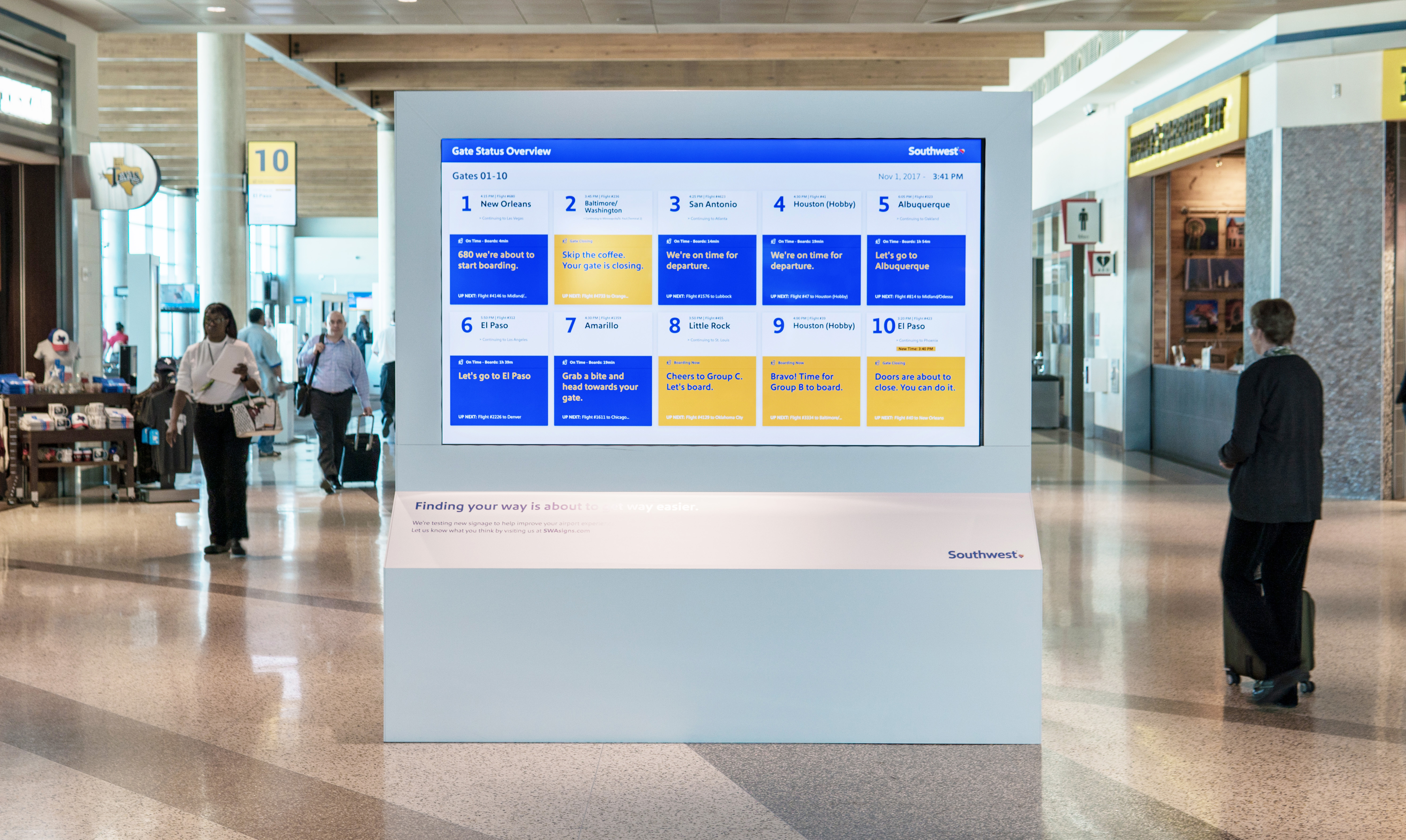
Working closely with Southwest's innovation, operations, and data science teams, we designed a new digital wayfinding system to guide customers through the airport. Based on customer and employee feedback, we redesigned all of the existing airport signage and added new sign types at key locations throughout the airport. Each sign in the new system was fully digital and location-aware, so that we could tailor each sign based on time of day, flight status, and customer needs.
Knowing that installing new hardware inside of a highly-regulated airport and developing a functional back-end is a costly and logistically complicated task, we made sure to test the system responsibly before moving into a live in-market prototype. This included mocking up a full-scale airport using foam-core and projectors in order to conduct user testing as well as modeling the entire airport in virtual reality to better understand sight lines and sizing. These steps helped build buy-in within the organization by allowing us to socialize the new concept in a compelling and easy-to-understand manner. We also ensured that the system resonated with both customers and employees before Southwest made a major investment.
After successfully testing our concept with consumers via a low-fidelity mock-up, the team brought the experience to real users, live, at Dallas Love Field airport, during the busiest travel time of the year. The experience was built on a similar infrastructure that will eventually be deployed at scale, so that technology can be tested simultaneously with the user experience.
Continuum brought the Southwest brand to life using natural language and a whole lot of love in our signage. We brought the personality of Southwest's employees into the signage as well. Customers can learn more about their operations, their employees, and can even give the ground crew a virtual "high five" to say thank you. Throughout the design process, we kept Southwest employees in mind, too. The system is designed to answer common customer questions, so employees can spend more time providing great customer experiences and less energy looking up flight times.


